Reading:
Color Psychology in Interior Design: Choosing the Right Countertop Hue
Selecting the right countertop colors is nuanced, especially in high-end design projects where every detail impacts the overall aesthetic. Every hue has the power to influence the atmosphere of a space and how it resonates with its users.
This guide delves deeper into the psychology of color and its role in shaping environments, from the calmness of neutral tones to the intimacy of darker shades.
The Emotional Impact of Countertop Colors
Color perception transcends mere visual stimulation—it deeply influences emotions and psychological states. When choosing countertop hues, it’s essential to understand how subtle color variations can shape a space’s atmosphere. Different colors carry specific emotional weights, and aligning these shades with the desired feelings can transform any interior.
Hue: The Emotional Foundation
Each hue inherently carries psychological associations. For example, one of the fundamental things we’ve learned from color psychology in interior design is that blue often evokes calmness and trust, while red is linked to energy and passion.
When it comes to countertop designs, here’s how specific colors affect different spaces:
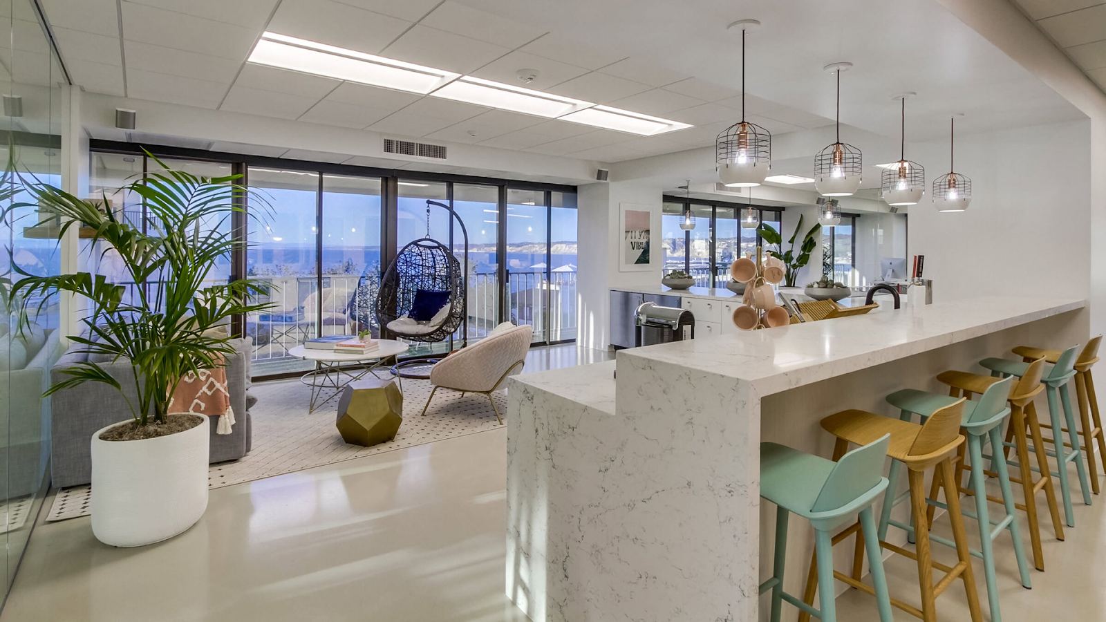
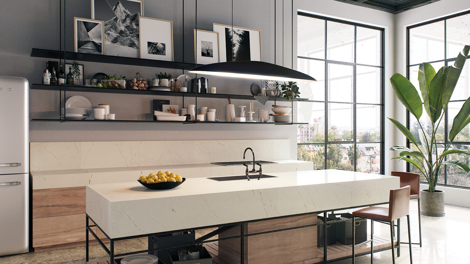
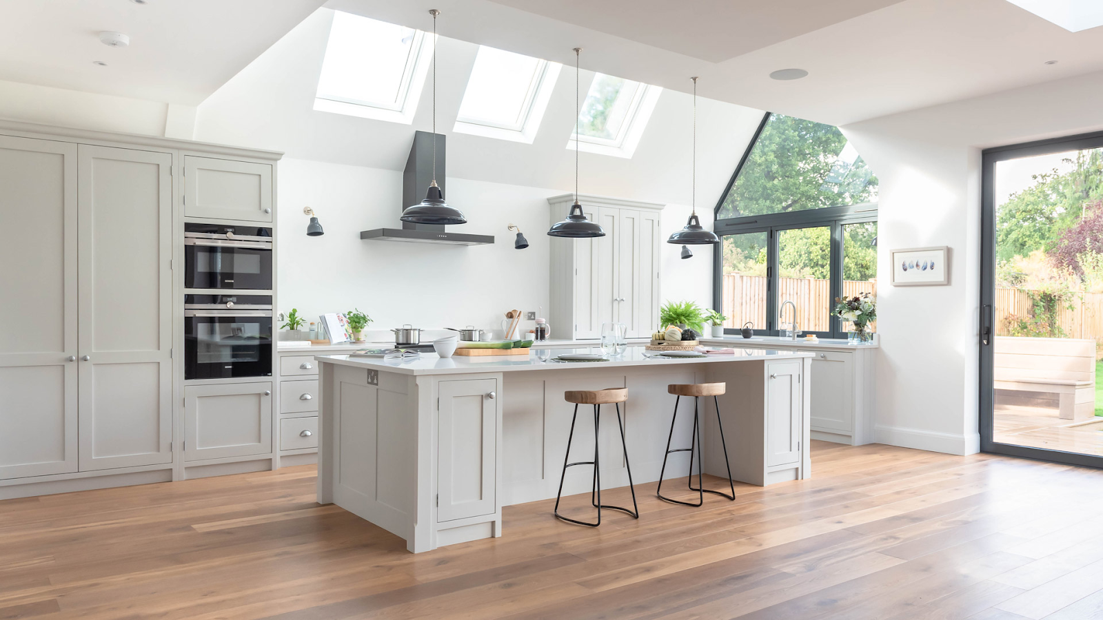
Whites
Soft, bright whites like Caesarstone’s Alpine Mist and Calacatta Nuvo evoke cleanliness, simplicity, and spaciousness. These hues are ideal for creating open, minimalist environments, particularly in kitchens and bathrooms.
Greys
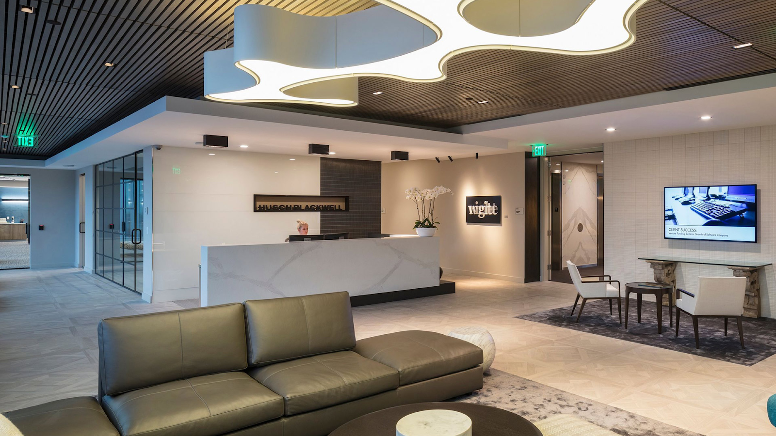
Greys bring sophistication and modern elegance to a space. These tend to foster a sense of professionalism and neutrality, making them ideal for high-traffic areas like commercial kitchens or office lobbies. The versatility of this color allows it to balance other design elements without overwhelming the space.
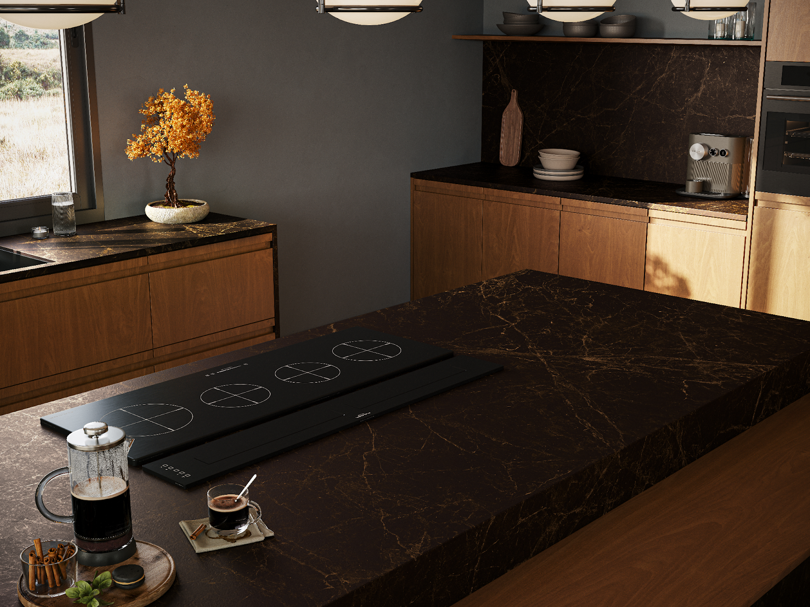
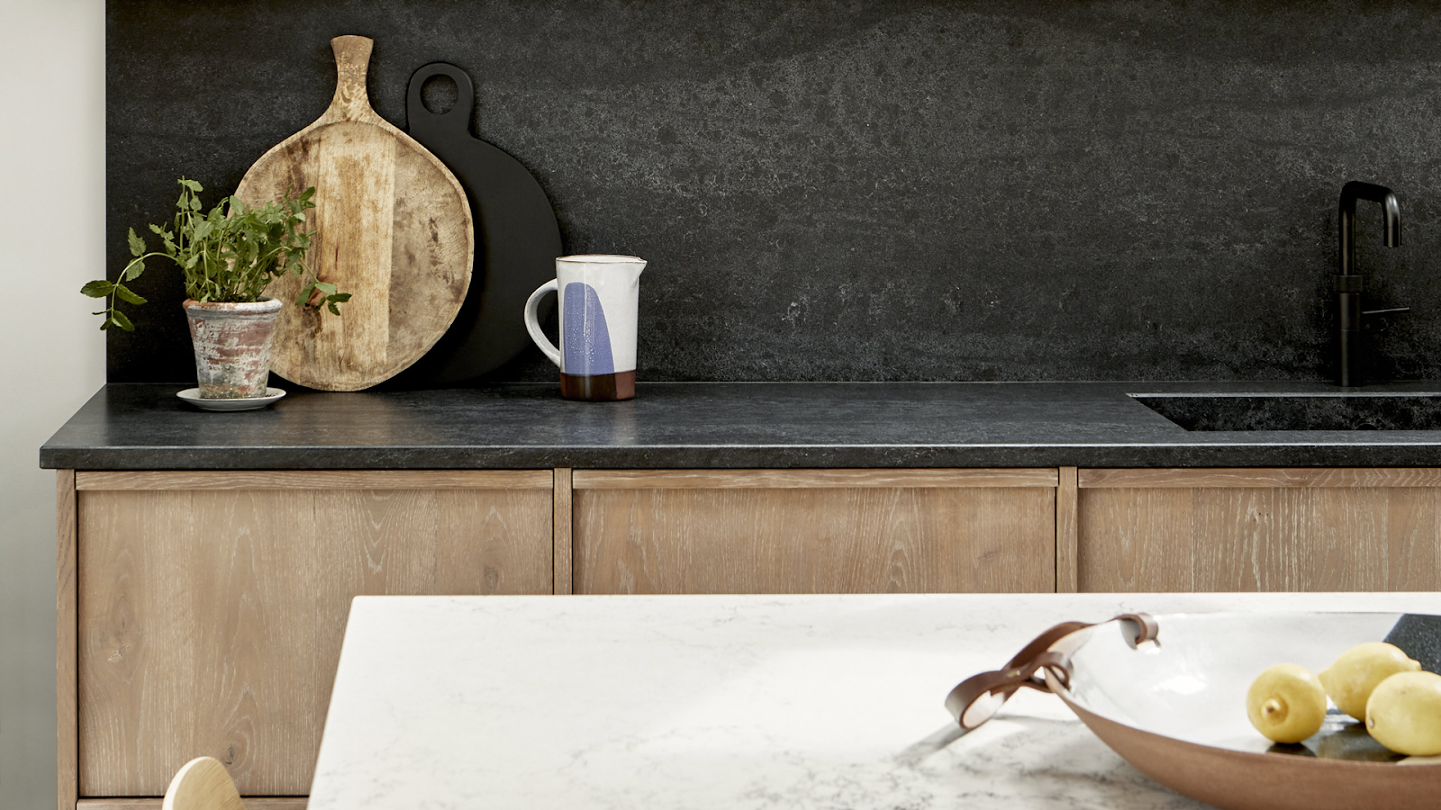
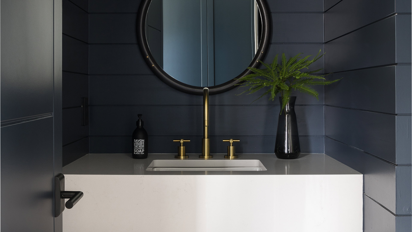
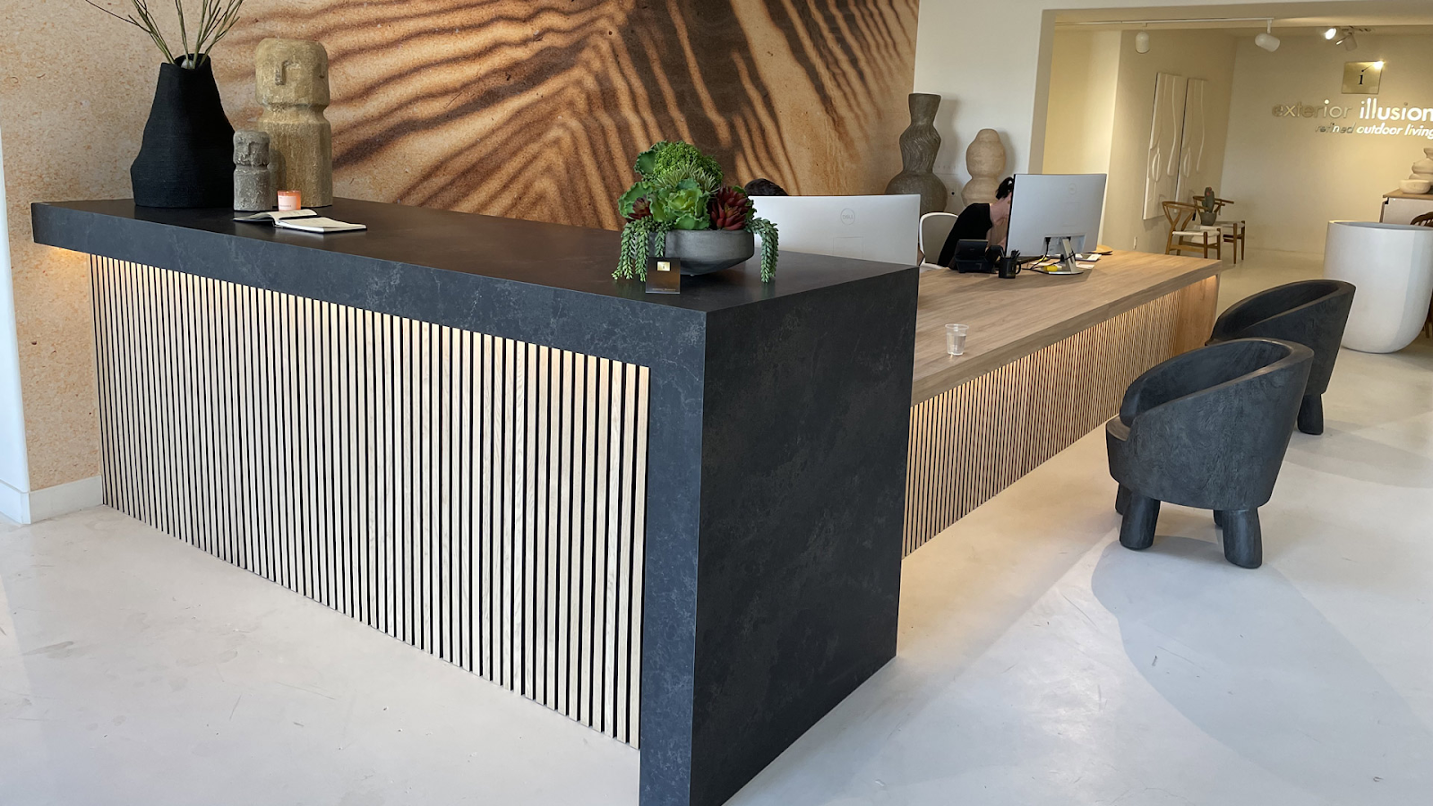
Bold Blacks and Dark Hues
Darker shades are worth considering if you want to introduce a sense of modernity, luxury, and intimacy into the spaces you’re working on. They are particularly effective in upscale kitchens and corporate environments where authority and refinement are the focus. These hues also offer depth and drama, making them perfect for bold, statement-making designs.
Saturation: Intensity Matters
Besides hues, saturation or intensity can significantly impact a color’s emotional perception. Highly saturated hues can create a bold and energetic feel, making them excellent for spaces that aim to inspire creativity and activity.
Caesarstone’s Emprada, for example, boasts rich veining and dynamic textures that easily make it the focal point in any space, whether as a kitchen island or a statement installation.
Conversely, muted colors create a calming and grounding effect. Designs like White Attica and White Ciment provide subtlety and tranquility as they seamlessly blend into the overall design. These desaturated hues are perfect for spaces aiming for a cohesive, understated aesthetic.
Brightness: Light and Dark Variations
Brightness levels, ranging from airy whites to deep blacks, can also transform how a space is perceived. Color psychology in interior design shows that bright tones reflect more light, amplifying a room’s sense of openness, while darker tones create a more intimate atmosphere.
Bright Whites and Light Tones
If you aim to enhance natural light and make spaces feel larger and more open, designs like Aterra Blanca and Alpine Mist may be perfect for your ideas. These surfaces are ideal for smaller kitchens or office areas where maximizing light and creating a clean, open feeling is essential.
Darker Countertops
On the other hand, deeper tones are a better fit if you’re after richness and depth. Dark designs such as Black Tempal and Jet Black can create striking contrasts especially when paired with lighter cabinetry, making them perfect for spaces seeking to project elegance and sophistication.
Contextual Use of Color in Countertops
When designing spaces with specific functions, the psychology of color in interior design plays an instrumental role in choosing the right countertop hues to elevate the atmosphere and meet the room’s intended purpose.
For Energizing and Social Kitchens
Vibrant colors in the kitchen encourage activity and socialization, making it an ideal space to incorporate warmer tones.
Caesarstone’s designs from the Supernatural and Supernatural Ultra collections, like Sleet and Mirabel feature rich, warm veining that helps stimulate both creativity and appetite. Their elegant simplicity can add energy to the space and transform kitchens into inviting and dynamic environments.
For Clean and Fresh Bathrooms
For bathrooms, classic white tones, such as Pure White and Blizzard, are perfect for creating a fresh and tranquil ambiance. Besides reflecting light and enhancing space and openness, these light tones also evoke a serene atmosphere ideal for designing relaxing spaces.
For Inviting Lobbies
Lobbies are visitors’ first impressions of a commercial space. Caesarstone’s dark, luxurious tones, like Impermia and Vanilla Noir, bring an air of sophistication and authority, making lobbies feel elegant and professional. These darker hues evoke refinement and are perfect for spaces where you want to convey a sense of importance.

Alternatively, lighter shades like Aterra Verity and Goldfinch offer a clean, modern aesthetic, ideal for smaller lobbies that aim to project simplicity while making the space feel larger and more airy.
Color Psychology and Sustainability
Hues can also be used to appeal to clients seeking eco-friendly designs. Below, we explore how the psychology of color in interior design can connect spaces to nature and even create a sense of harmony and responsibility toward the environment.
Light and Neutral Tones for Calmness and Openness
Light, neutral hues like Frosty Carrina are excellent choices for creating a sense of calm and cleanliness. As these tones promote a bright, open feeling, they’re perfect for spaces where tranquility and cleanliness are a priority, such as minimalist kitchens or eco-friendly office spaces.
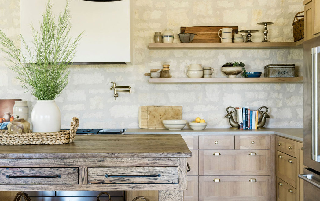
Earth Tones for Warmth and Comfort
Designs that draw inspiration from nature often feel the most inviting. Incorporating colors that echo the earth’s natural palette can introduce warmth and stability to any space.
Soft, grounding tones like Primordia and Moorland Fog create an organic feel, making them ideal for environments focused on comfort and relaxation. Whether in a cozy restaurant or a serene family kitchen, these hues provide a sense of calm while embracing sustainability.
Bold and Dark Hues for Elegance and Intimacy
For upscale kitchens, hotel lobbies, or restaurants, black designs like Darcrest and dark greys like Magnate and offer a luxurious and sophisticated look. Dark tones convey power, elegance, and intimacy, making them ideal for creating bold statements in both commercial and residential spaces.
Black and dark greys add depth and drama, perfect for high-end or intimate areas like fine dining restaurants or luxurious lobbies. Additionally, darker surfaces can reduce the need for frequent cleaning in busy spaces, making them practical and sustainable choices for high-traffic areas.
Find the Perfect Hue for Your Design Vision at Caesarstone
Choosing the right countertop hue is essential for elevating any space, whether you’re designing a serene kitchen or a dramatic commercial lobby. Caesarstone’s wide selection of hues is thoughtfully crafted to enhance both the aesthetic and emotional experience of your projects.
Explore how color can transform your designs by ordering up to four free samples today, delivered directly to your door at no charge.