Milano 2023: A Return to Normality
Discover GROHE and Caesarstone's outstanding collaboration and other extraordinary installations from Salone del Mobile Milano 2023

The endless lines have returned to Milan Design Week, winding their way between historical museums and abandoned abattoirs, where one installation stood out of the crowd: GROHE’s new collaboration with Caesarstone.
Last month, Milan Design Week it has returned to its traditional April date for the first time since the COVID-19 pandemic. The organizers’ collective sigh of relief was audible in every corner of the city: in the long lines outside the fairgrounds at the entrance to the pavilions, in the city center streets bursting with people that made driving impossible, in the metro cars packed so tightly that, during most of the day, not even a pin could have fit into the crowd.
After the event was canceled in 2020, a scaled-down version was held in September 2021, and then last year, it was postponed from April to June. This year was a long-awaited return to the spring season. The numbers say it all: nearly 310,000 visitors from 181 countries came to Salone del Mobile, the city’s commercial furniture fair, representing a 15% increase over 2022.
Attention-grabbing locations and impressive installations
Palaces next to churches, a swimming pool by a tennis club, a defunct bank branch neighboring an abandoned abattoir – as every year, these were the attention-grabbing locations forming the settings of some of the event’s most impressive installations and displays. One of the installations that particularly stood out was by GROHE, the leading German manufacturer of bathroom and kitchen fittings, in partnership with Caesarstone. The result was an extraordinary minimalist bathroom that offered an innovative multisensory experience.
Collaboration of the Elements
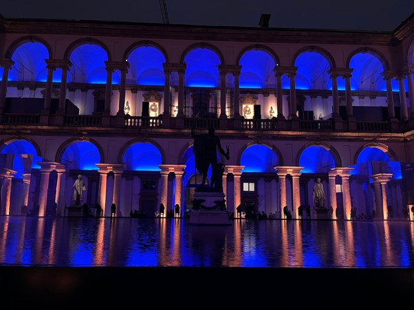
GROHE’s installation was in the inner courtyard of Pinacoteca di Brera, one of the beautiful historical museums in the city’s design center. Framed by a portico of columns, a large pool of water was placed in the middle of the courtyard, with a magnificent bronze statue of Napoleon at its center. Rooms stood in each corner of the pool, covered with mirrors reflecting the water and the museum’s unique architecture, where visitors could view the company’s products.
The installation provided a rare tranquility amid the typical Design Week hustle and bustle. Instead, inspired by the belief that water is the source of vital energy, the installation primarily served to highlight the launch of GROHE SPA. This new premium brand seeks to transform the bathroom into a home spa, not simply through individual products, but by creating a complete experience that includes custom bathroom design, elegant faucet collections, ceiling-mounted rainfall showers, and complementary accessories intended to appeal to all the senses while redefining what is possible through innovation and technology.
Karl Lennon, leader of Grohe Spa, explains how the collaboration came about.
“Once we thought of the design concept and how it might work, we considered what we could use. We know Caesarstone to be a durable, high-quality, and beautiful product. In addition, Grohe and Caesarstone have a similar audience in that we work with architects and designers, and there’s a synergy between the product and the environment. So, you could have a Caesarstone handle to match the surface. It’s just a great fit for us to incorporate some of their materials within the Private Collection, and that’s not something we’ve done, so it is a new and exciting avenue for us.”
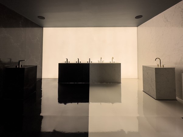
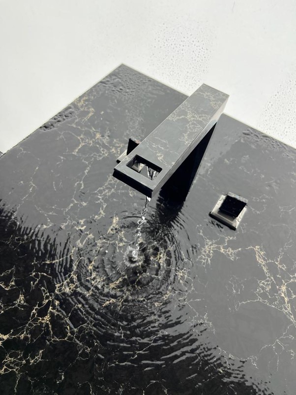
One of the rooms was dedicated to the brand’s collaboration with Caesarstone. The space was exquisite, adorned with Caesarstone’s timeless and durable quartz designs in the contrasting 5143 White Attica and 5100 Vanilla Noir models. White Attica invokes the luxury of an opulent white marble through its white base and the alluring combination of dark and light blue-grey veins which ebb across the surface. On the other hand, Vanilla Noir has a rich, dark base that is awash with expanding creamy vanilla veins, exuding a moody, sophisticated feeling.
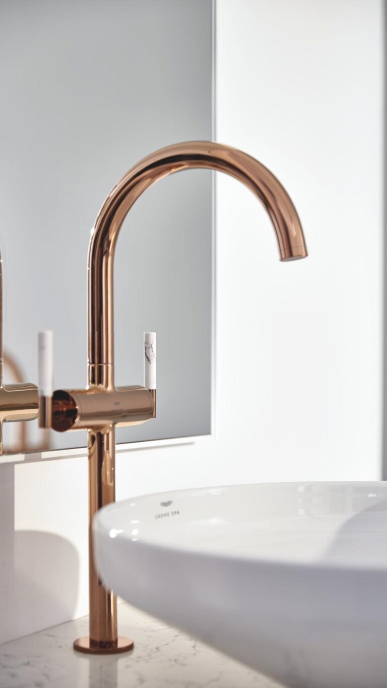
The new product line won the 2023 Gold iF Design Award during Design Week. It was launched as a bespoke premium collection, including faucets, faucet handles, and shower/tub handles inlaid with Caesarstone, giving the effect of exquisite jewelry or amulets. Ornamenting GROHE’s stylish fixtures made it possible to appreciate the full creative power of Caesarstone’s organic and sustainable surfaces, drawing on nature’s inspirational beauty.
“We are used to seeing Caesarstone designs on a large scale in bathroom and spa environments. What is delightful about this partnership is the clever intricacy and precision that GROHE has used to design their new Atrio and Allure Brilliant Private Collections. A highly thoughtful approach sees Caesarstone surfaces successfully translate to a smaller scale, bringing a great unity between faucet and countertop when combined with Caesarstone of the same design. The result is a complete look of singular harmony.”
Mor Krisher, Caesarstone’s Global Head of Design.
Recycled Jeans & Abandoned Abattoirs
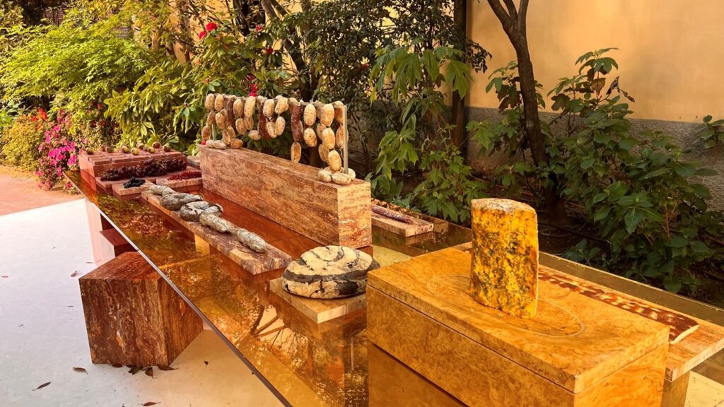
Across the city, the Fuorisalone award for the best installation went to the Dutch material brand SolidNature, whose installation was designed by the acclaimed OMA Architects. Under the title “Beyond the Surface,” SolidNature presented an immersive experience on two levels. The underground level included a sequence of spaces that examined parallels between the lifecycle of stone and the nature of humanity. In the garden above, the installation continued with animal sculptures that raised additional options for using the material, alongside an exceptionally long buffet table designed by Sabine Marcelis, which was piled with treats and flawlessly merged with the local scenery.
The ALCOVA platform, which insists on popping up every year in a new alternative space around the city, successfully managed to convey a youthful, avant-garde atmosphere for the fifth time – and to arouse curiosity even before it opened. Last year it was a former military hospital. This year visitors were invited to an industrial complex centered on an abandoned slaughterhouse. The ghosts of the complex played an integral role in the mystery and attraction of the event, as well as the eclectic mix of young designers, student exhibits, and commercial companies seeking to keep a finger on Design Week’s hipster pulse. The abandoned location lent ambiance to the exhibits, and everything was excellently presented, but the bottom line was that the hype and sense of FOMO were not always justified.
Of particular interest – and also beautifully depicted – was the installation by Dutch designer Maarten Baas, who returned to Milan with “More or Less” in collaboration with the G-Star RAW fashion brand. It was presented in a 16th-century structure used in the past as a church. At the center of this impressive space stands a 15-meter-long private jet, alongside wardrobes and benches on the lower level, all created from recycled G-Star jeans collected via the brand’s Return Your Denim program. The idea was cultivated to highlight the tension and duality between the desire for more and the need for less.
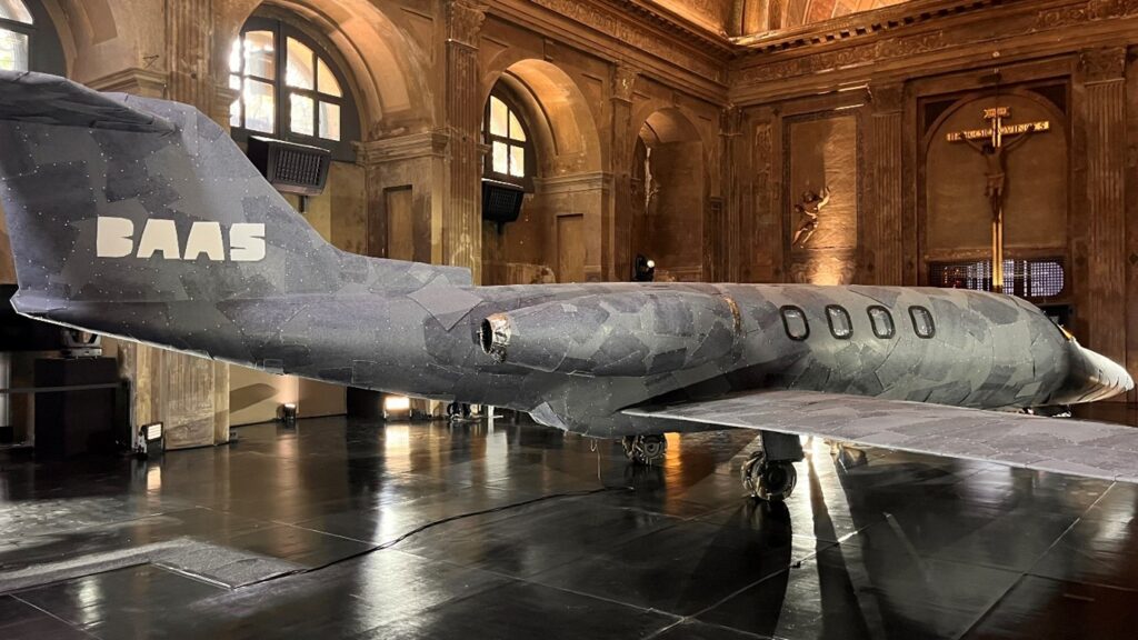
“Each year in Milan, I enjoy the tragicomic dialogue between green design and mass consumption,” Baas said, explaining the title of his installation. “When G-Star approached me to work with recycled jeans, it was the perfect opportunity to address this funny duality instead of just acting like we’re saving the world. Of course, we are not saving the world, but are we making strides? More or less…”
G-Star was far from the only fashion brand with a presence at Design Week: Dior once again collaborated with Philippe Starck, while Bottega Veneta teamed up with designer Gaetano Pesce, and Missoni offered a surreal installation featuring colorful donut-like elements. In addition, Versace and Dolce & Gabbana presented new home decor collections, and Karl Lagerfeld’s fashion house revealed its first-ever home collection, expressing the colorful image and character of the prolific designer, who passed away four years ago.
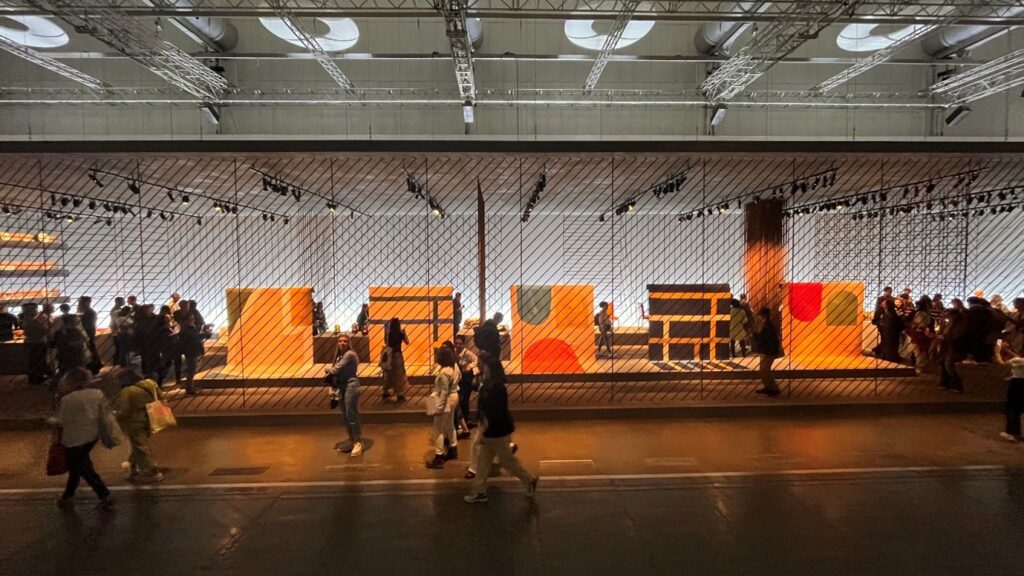
The Hermès display also garnered attention again this year. The French luxury design house presented its textiles and homewares on sturdy concrete bases framed by a geometric cage of industrial iron rods. The installation celebrated simplicity and expressed what it defined as “the power of fundamentals.” Large rugs embroidered with graphic motifs, sofas upholstered with wool and cotton, lantern-style glass lamps, and porcelain dishes illustrated with iconography from the riding world, with a nod to Hermès’ history. At the end of the Design Week, every part of the installation was intended to be recycled and reused.
100 Years of Italian Design, 80 Years of IKEA
The return to normality, coupled with the perception of Milan as the world’s most influential design event, was also reflected in the number of companies and brands that chose to celebrate anniversaries and other historic milestones during Design Week. For example, Herman Miller celebrated 100 years since the opening of its showroom at the heart of the city while illustrating the company’s changes, from manufacturing traditional home furnishings to leading the field of contemporary modern furniture. This was accomplished through unique textiles and advertising posters by some of the world’s top designers.
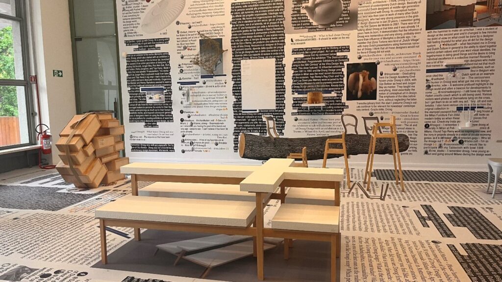
At the Triennale Museum, alongside an exhibition marking 100 years of Italian design, the influential Dutch collective Droog Design celebrated 30 years since its international debut. Many well-known names participated in its “Design or Non-Design?” exhibition, including Marcel Wanders, Maarten Baas, and FormaFantasma. The collective, which is responsible for putting Dutch design on the map, was known for upending the design world’s conventions regarding functionality, as well as for its dry humor (“droog” means “dry” in Dutch). Adding a twist to ready-made objects infuses them with new meanings.
For the 50th anniversary of its I Maestri collection, Cassina presented Echoes, one of this year’s most stunning and successful installations, within a defunct Credito Italiano bank branch in the city center, including its basement. The I Maestri collection was officially launched in 1973 with the introduction of furniture pieces by Gerrit Rietveld and Charles Rennie Mackintosh to the company’s catalog. Today, the collection combines some of the 20th century’s most iconic furniture.
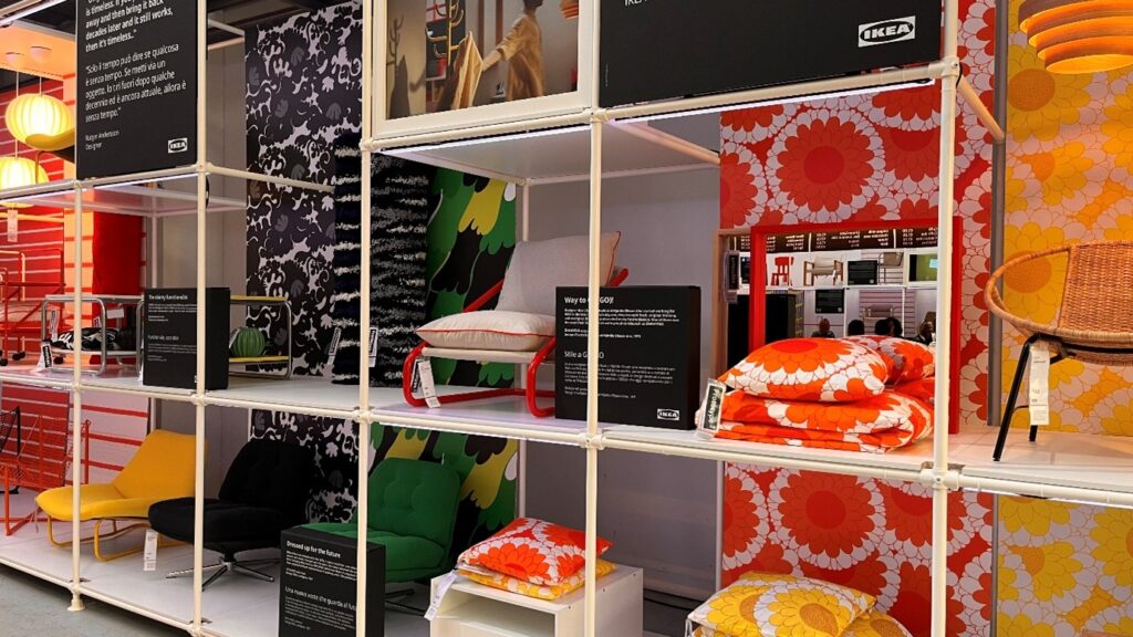
Swedish furniture giant IKEA celebrated its 80th birthday with the Assembling the Future Together installation, which expressed the way we all assemble IKEA furniture ourselves with the same iconic hex key – a massive replica of which hung from the ceiling at the installation entrance. The large hangar in the Tortona neighborhood presented historical furnishings from the company’s archives alongside a new collection that added a contemporary twist to those original pieces with simple, functional, and playful elements. In addition, four installations representing the four elements – fire, water, earth, and wind – sought to show how IKEA uses design and new product development to encourage people to “do something good for people and the planet.”
The aftermath of the event generated mixed emotions. While it raised concerns about whether we have learned anything from the pandemic and if it’s feasible to return to the pre-pandemic days, it also brought joy as it signified that the design industry could move past the global trauma caused by COVID-19 and concentrate on the future.